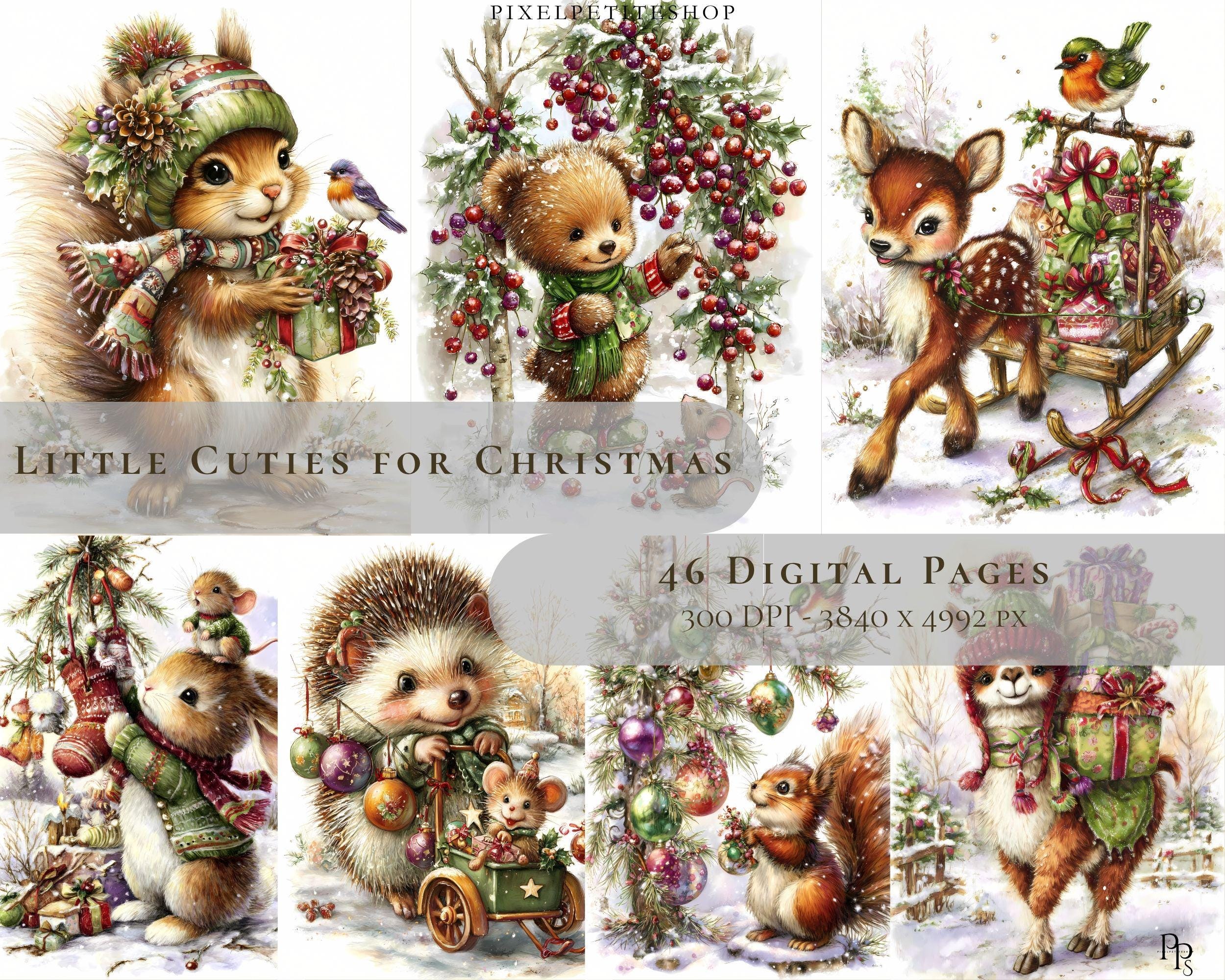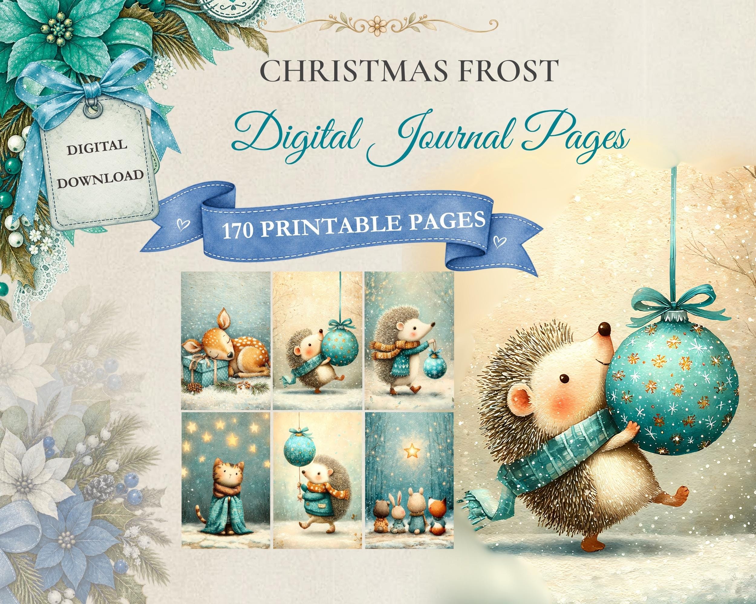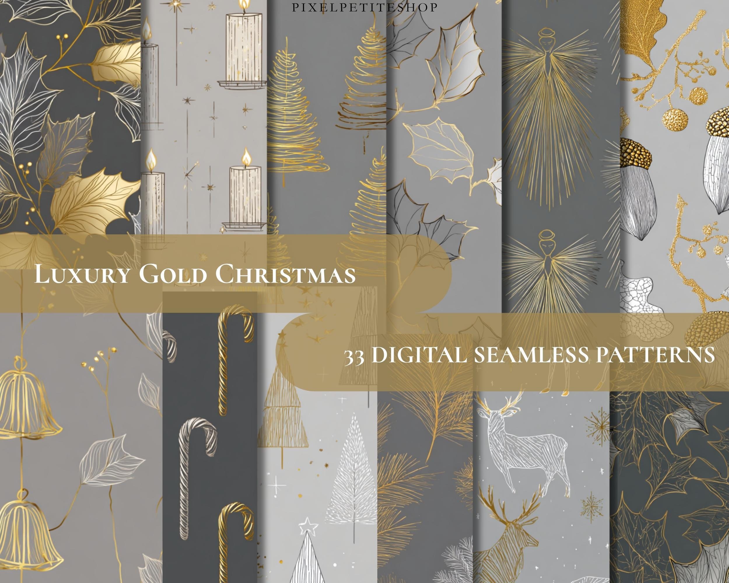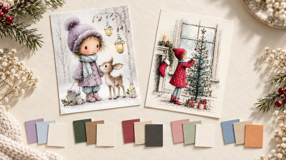
Colour can help a small paper project feel like a whole idea. A card, bookmark, or journal page does not need lots of matching decoration if two or three colours already connect its parts.
Start by looking at the illustration you want to use. Pick a main colour, a supporting colour, and a quiet background. You can repeat them in plain paper, handwriting, or a little strip of pattern. Here are five palette ideas to consider when browsing woodland and vintage-style artwork.
1. Lavender, icy blue, and cream
This combination suggests a soft winter mood. Lavender gives it character, pale blue echoes a cool sky or snowy scene, and cream makes a gentle place for a message.
The woodland winter collection offers a natural starting point. Choose one lavender detail from your favourite illustration and repeat that colour in a small title or plain paper border.
Try it for a winter greeting, a reading bookmark, or a page about a quiet day. Darker writing on the pale background will be easier to read than pale lettering over a detailed scene.
2. Forest green, warm brown, and ivory
Green and brown can echo leaves, tree trunks, and woodland paths. Ivory gives the darker colours a little space and keeps the page from feeling too heavy.
Use this palette with artwork that already includes those tones. Let green take the largest decorative area, keep brown for a smaller detail, and reserve the light background for your words.
It could suit walking notes, a nature-themed gift tag, or a journal divider for outdoor memories. One leaf or animal illustration may be all the extra decoration you need.
3. Muted red, antique cream, and charcoal
A restrained red accent can give vintage-style Christmas papers a warm focus. Antique cream connects naturally with aged-paper textures, while charcoal makes a useful writing colour.
Look through the vintage Christmas paper collection for a scene with a red coat or another small red detail. Repeat that accent once, perhaps in a title or border, and let the illustration hold the rest.
This direction could suit a family recipe card, a note about an old decoration, or a gift tag on plain wrapping paper.
4. Dusty pink, soft green, and warm white
This palette can bring a gentle mood to floral or garden-inspired papers. The green steadies the pink, and warm white provides a clear background for a personal message.
If the artwork has several flower colours, choose one rather than trying to repeat them all. A little pink accent beside a green detail can still feel connected to a much richer illustration.
Try it for a thank-you card, a note to a gardener, or a page about something small you appreciated. The colours are a suggestion; use the shades that already belong to your chosen paper.
5. Soft blue, sandy beige, and a warm orange accent
Blue and beige can suggest sky, buildings, or a travel memory. A small orange accent brings some energy without needing a brightly coloured background everywhere.
This is a possible direction for a city journal page or a letter about an outing. Choose an illustration with suitable colours, then keep the strongest accent for one small detail. Your photograph or handwritten place name can become the focus.
Choose a balance you enjoy
Give most of the page to the quieter colour and use the strongest shade sparingly. If everything feels busy, add plain space before adding more decoration.
These palettes are starting points, not rules or promises of exact print colours. Screens, paper, and printers can make the same file look different. A small test print will help if you want to match physical supplies closely.
Pick one illustration you love, borrow a few of its colours, and use them again nearby. That small repetition can make even a simple page feel considered.